Turning up the volume for an audio brand
The Canton logo is a true icon. We are rethinking it for digital applications – giving the brand new opportunities to tell the story of the clearest sound.
Read more
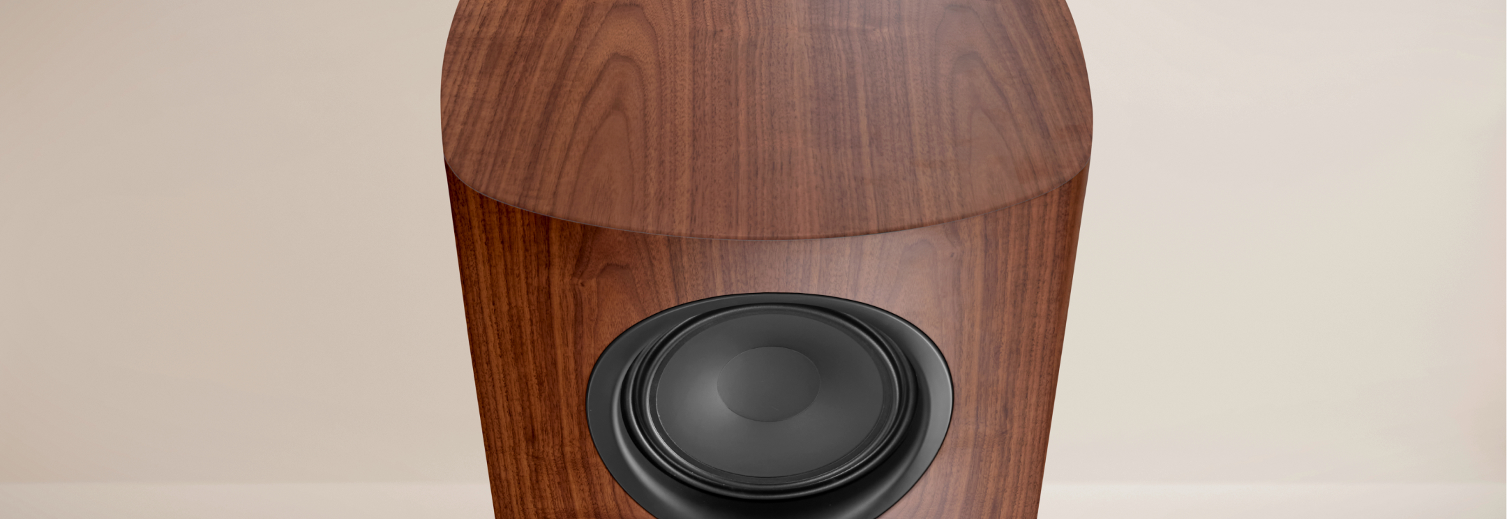
A story about stereo sound – with the volume increasing from soft to loud – distilled into six letters: The Canton logo is so good, it still serves the loudspeaker brand well after fifty years. However, good stories are not only printed today, they are also brought to life digitally.
So we gave the logo new possibilities and enabled it to react to sounds visually: We made even the most delicate audio nuances part of the brand, which stands for acoustic precision like no other. We also expanded the set of design elements: Derived from the design language of the logo are the Canton Sound Shapes, colored segments of circles that – depending on their cut, alignment, pattern repeat or transparency – reflect the characteristics of a wide variety of musical styles. The result: Canton gains new flexibility to communicate the diversity of the brand and its products even before the first sound is heard. In digital media, on the user interfaces for controlling smart devices or at trade fairs and events.


Sebastian
Design Director

Felix
Executive Creative Director
Mail to Felix

Next up
Delta Café
Delta Café